Policy 07
Accessibility
This site is about colour, which makes accessibility a design problem rather than an afterthought. Nothing here depends on being able to distinguish two colours.
- Last updated
- 5 September 2026
- Target standard
- WCAG 2.1 level AA
- Body text contrast
- 16.68:1 and 5.20:1
Something here unclear? Write to us and a person will answer. Support.
1. The standard we work to
We aim to meet the Web Content Accessibility Guidelines 2.1 at level AA throughout. Where we fall short of that, section 6 says so.
2. Colour is never the conclusion
The whole product is a picture made of colour, so colour cannot also be how a finding is communicated. Every break in a sequence is marked with a drawn shape and a written label, never by making something red or green.
Every colour strip on this site is accompanied by a plain-text equivalent describing each band and each transition in words, including the numeric hue and lightness gaps that produced the reading. A screen reader user gets the same information as a sighted user, and so does anyone who cannot tell navy from charcoal.
3. Measured contrast
Contrast ratios were measured from the actual colour values rather than estimated. The measurements are recorded in a comment at the top of the site’s stylesheet so they can be checked against the code.
- Body text on the page background: 16.68:1 — level AAA.
- Secondary text on the page background: 5.20:1 — level AA.
- Page background on the navy, oxblood and charcoal panels: 10.98:1, 9.66:1 and 10.75:1 — level AAA.
- Ink text on the camel panel: 5.50:1 — level AA.
Two of the eight colours measure below 4.5:1 against the page background. They are used only as swatch fills and hairlines, and they never carry text.
4. Keyboard and screen reader
- Every interactive control is a native HTML element, so everything is reachable and operable by keyboard without any scripting of ours.
- The sock-colour switcher on the front page is a radio group: tab to it, then move through the colours with the arrow keys.
- The shorts control is a checkbox: tab to it and press space. The whole apparatus withdraws and the change is announced.
- Readings are announced through a live region, so a change is spoken without moving focus.
- Focus is always visible, as a two-pixel outline offset from the element.
- A skip link is the first thing in the tab order on every page.
- Every image carries alt text describing what is in the frame.
5. Motion and text size
There is very little movement on this site, and what there is respects prefers-reduced-motion: if your system asks for reduced motion, transitions are suppressed.
Text is set in relative units and reflows to 200% zoom without loss of content or function. No page scrolls horizontally at 320 pixels wide.
6. Known limitations
- The colour strip is decorative to a screen reader and is marked as such; the written equivalent beside it carries the information. This is deliberate, but it does mean the figure itself conveys nothing when read aloud.
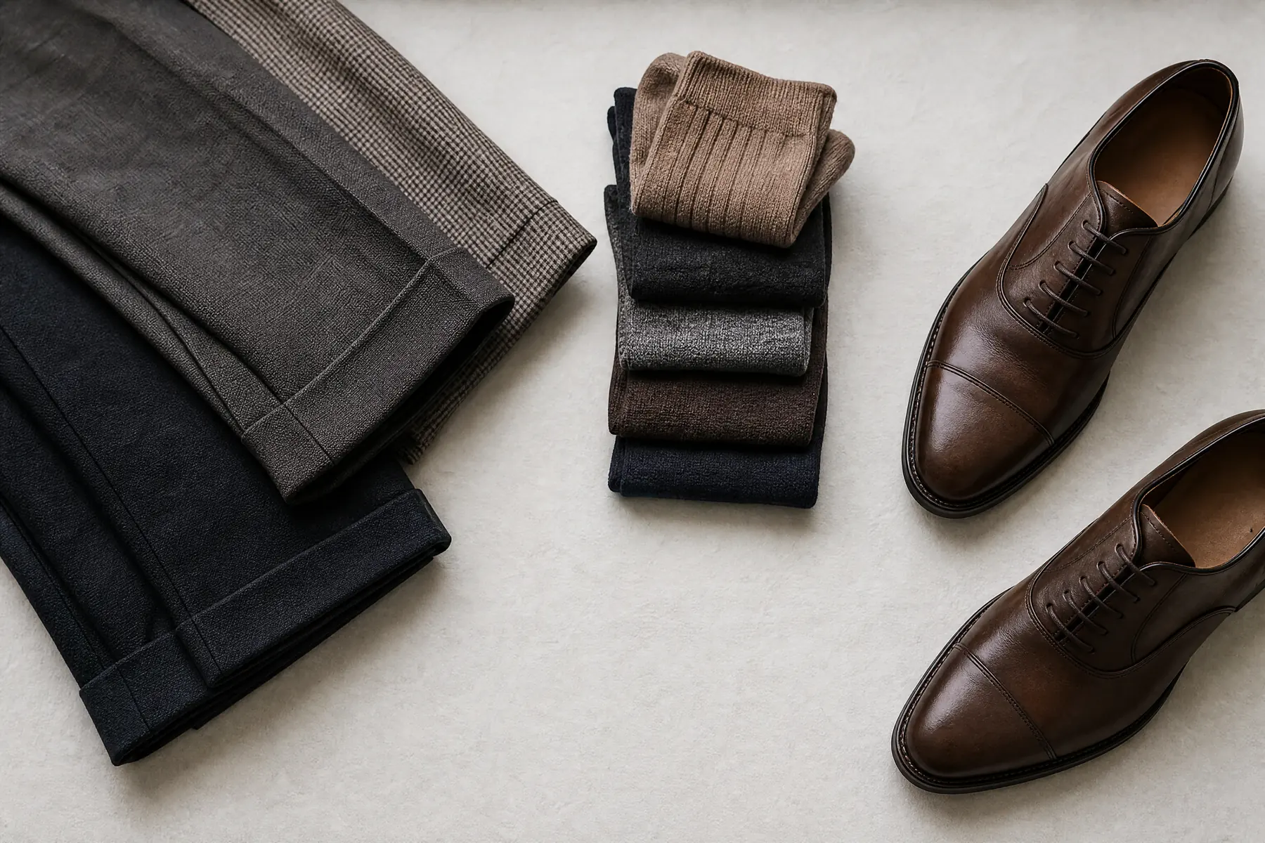
- Photographs of textiles are described by what is in them, not by their exact shade. A written description of a colour is not a substitute for seeing it, and we have not found a way around that.
7. Tell us what does not work
If any part of this site is difficult or impossible for you to use, please write to support@primehosiery.shop. Tell us the page and what happened, and we will reply within one working day.
If you need something on this site in another format, ask and we will provide it.